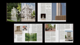
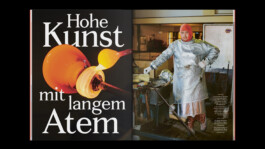
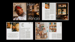
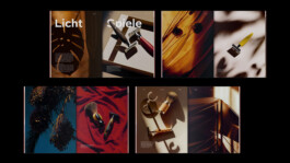
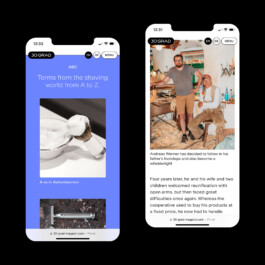
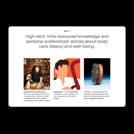
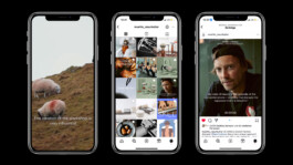
30 Grad Magazine
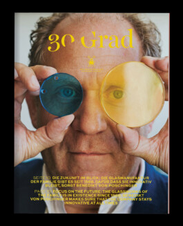
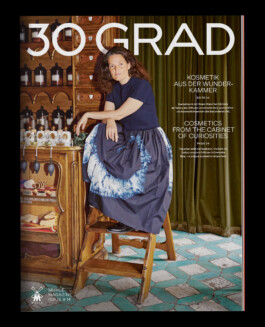
Since 2015, I’ve been concepting and overseeing 30 Grad, the customer magazine of Mühle, a third-generation family-owned shaving manufacturer in Saxony. With the launch of the online magazine in 2022, 30 Grad went through a full redesign to create a look that works seamlessly across print, social media and website. In addition to web and editorial design, I’m also art directing the still-life photo shoots. Logotype and logotype animation by Sascha Bente.


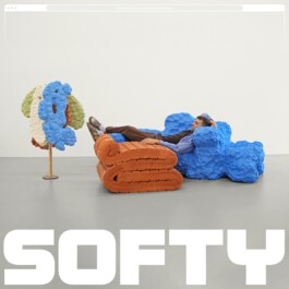
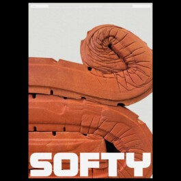
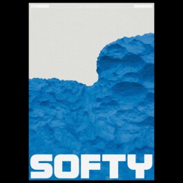
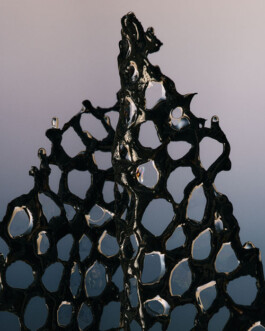
Softy
I designed the logo for Softy, a product line made entirely of one-of-a-kind pieces crafted from recycled mattresses. I also created two posters that visitors could buy and take home at the product exhibition. The pieces were designed by Simon Stanislawski, who completed his Master’s with Konstantin Grcic.
Circulor
Website for Circulor including images, icons, and animations. Circulor is a London-based company that uses digital solutions such as blockchain to bring transparency to complex supply chains, enabling sustainable, responsible, and compliant business practices. Animations in collaboration with Aljoscha Höhborn.
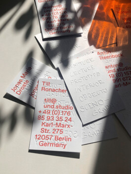
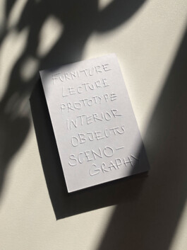
UND Studio
Business cards design for UND Studio, a product and interior design studio. Inspired by the studio’s focus on using a single material, the cards feature blind embossing. The digitally created handwritten embossing references the digital design process while also symbolizing the refinement of everyday objects—just like UND Studio’s furniture.
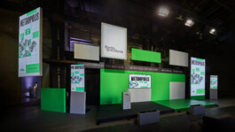
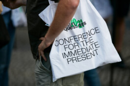
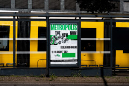
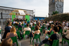
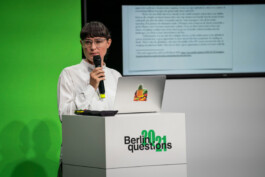
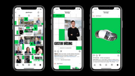
Berlin Questions
Full redesign for the yearly Berlin Questions conference. The concept is flexible: elements like the grid, website structure, and the Berlin Questions logotype stay the same each year, while key visuals, imagery, colors, and fonts change to reflect the yearly theme. The logo also gets updated with the year, using the typeface from that year’s concept. The design scope includes merch, website, social media, stage, OOH, and more. Animations in collaboration with Aljoscha Höhborn.


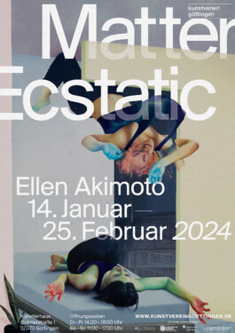
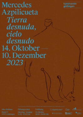
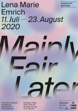
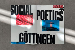
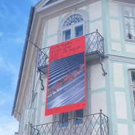
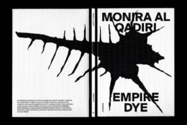
Kunstverein Göttingen
Together with Sascha Bente and Marius Land, I developed a design concept for Kunstverein Göttingen that balances strong recognition with enough space for each artist’s work to shine. Two different typefaces subtly indicate which of the two locations the exhibition is taking place in. Besides social media visuals and OOH media, the collaborations with artists like Monira Al Qadiri and Lena Marie Emrich also resulted in additional elements like books, merch, and exhibition materials.
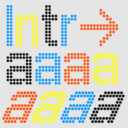
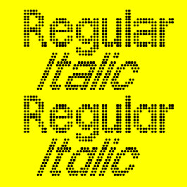
Intra Typeface
During a trip to New York, I documented diode-style type in the subway and digitized it. Based on my initial draft, Sascha Bente later created the Regular and Italic styles, which are now available for purchase. The type has been used for Frank Ocean’s Homer Radio and more recently by Spector Books. The animations made by Aljoscha Höhborn show the dynamic applications we had in mind for the typeface.
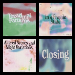
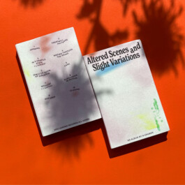
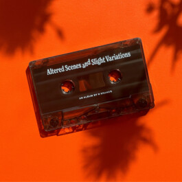
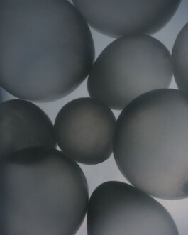
Altered Scenes
and Slight Variations
For N Kramer’s album Altered Scenes and Slight Variations, released on Leaving Records, I created a series of abstract animations that also set the visual style for the album and single covers. The goal was a look that feels unfinished, emphasizing a sense of ongoing process and constant evolution.
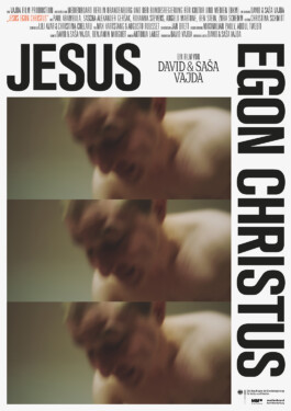
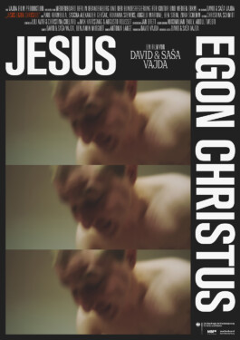
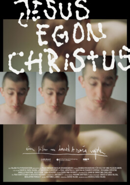
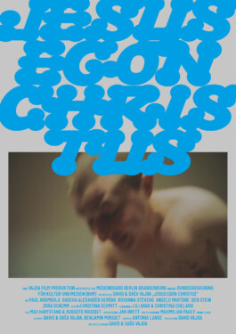
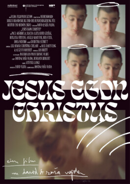
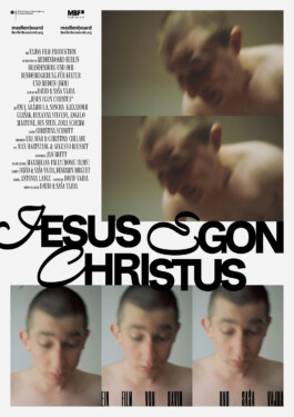
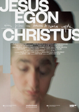
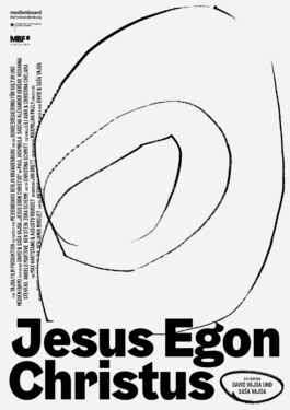
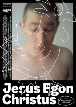
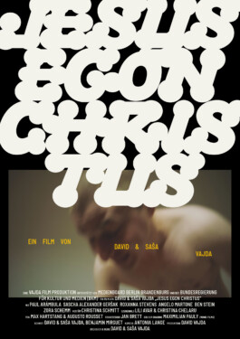
Jesus Egon Christus
Film posters for Jesus Egon Christus by Saša and David Vajda. Along the way, I also created a few additional concepts and visual experiments during the design process.
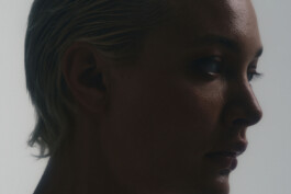
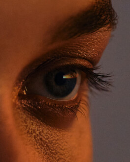
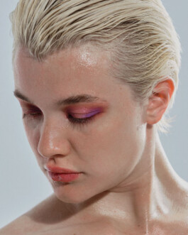
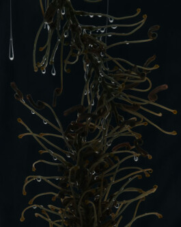
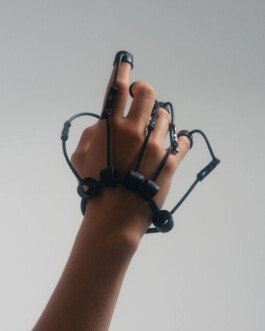
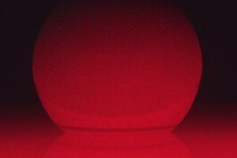
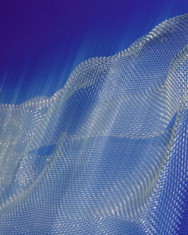
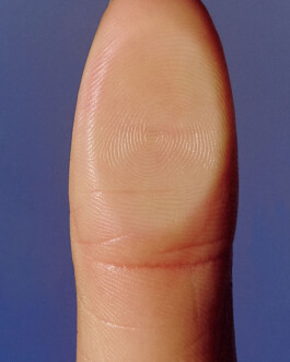
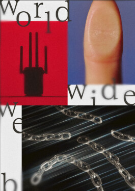
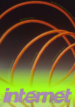
Death To Stock
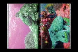
Art-directed two photoshoots for Death To Stock on the themes Dark Tech and Internet, photographed by Fanette Guilloud.


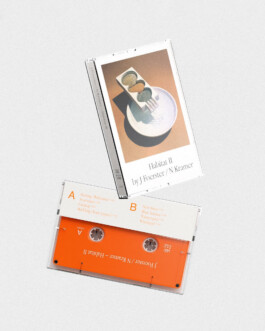
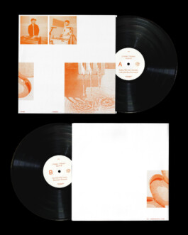
Habitat II
Graphic design for J Foerster and N Kramer’s album Habitat II, released via Leaving Records. The typeface used on the cover, which also appeared on the previous album Habitat I, creates a visual link between the two. Lily Clark kindly provided images and video of one of her artworks, which served as the key visual. All available material was used to integrate the artwork as dynamically as possible throughout the promotional phase.