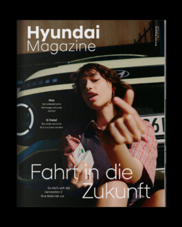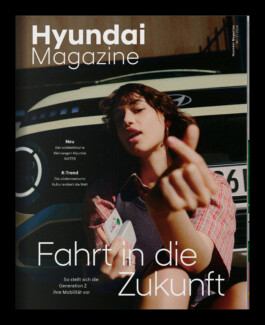
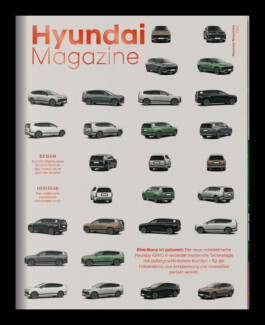
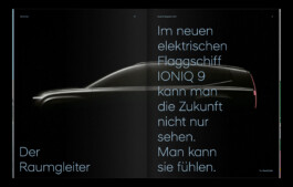
As Senior Art Director at muehlhausmoers, I led the redesign of the customer magazine for Hyundai and oversaw its implementation across subsequent issues. The previous design had become visually dated and increasingly impractical in editorial production, as text-heavy layouts left little room for visual hierarchy and contemporary magazine pacing.
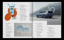
The redesign focused on establishing clarity and aligning the publication more closely with Hyundai’s design philosophy. A restrained editorial framework was introduced, including a refined pagination system, clearer section structures, and a typographic hierarchy that supports readability while giving content more space to breathe.
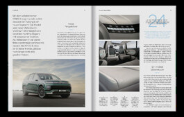
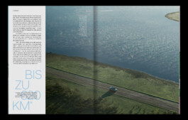
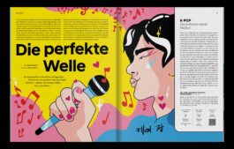
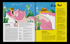
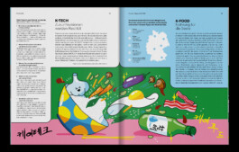
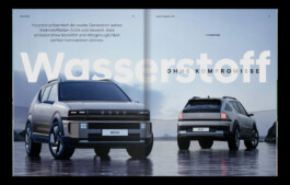
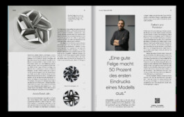
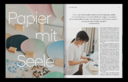
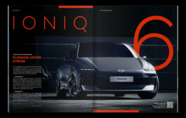
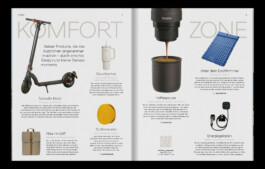
A key element of the concept was the deliberate use of white space to elevate imagery and editorial storytelling. The underlying layout system remains subtle and supportive, allowing articles, photography, and brand narratives to take center stage. Following the redesign, the visual system was applied and further developed across subsequent issues of the magazine, ensuring consistency while maintaining flexibility for different editorial topics.